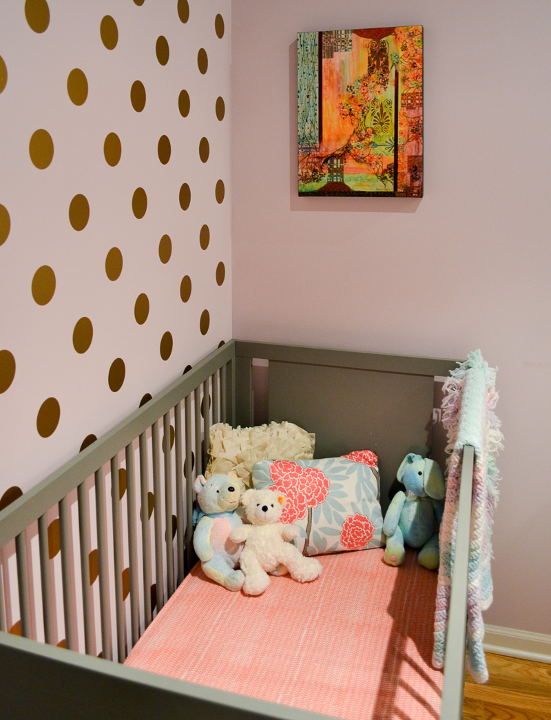
The nursery I designed for my daughter in our Chicago loft was small but sweet. The space felt fun and bright, pairing modern furniture with industrial architectural features.

Loft Nursery Floor Plan
This 8′ x 9′ room fit a lot in, but careful space planning made sure there was as much open floor space as possible and nothing felt cramped.
Loft Nursery Reveal
Industrial Features
Two of the nursery walls were partial – eight feet tall with a two foot gap to the ceiling. No windows meant no natural light, but high ceilings helped the room feel bright and airy.

Investing Where It Matters: The Crib
The Oeuf crib is an investment piece, but I chose it for a number of reasons: it’s solid wood, eco friendly, has no VOCs, and is made in Europe to strict standards. It also looks great.
I offset the cost of the crib by opting for more affordable pieces elsewhere in the room.

Design Details
The painting above the crib inspired the colour palette for this loft nursery. It has gold details, which I echoed on the feature wall behind the crib using circle decals. You can read about how I installed the dot decals here.

A large mirror gives the impression of a window, and helps bounce light around.
A refurbished glider sits next to the crib for reading and feeding.

It also served as a quiet spot for Ted, our dog, to avoid the abundance of “affection” thrust upon him by the kids.

Affordable Nursery Art
A framed sheet of wrapping paper sat above the glider. It originally lived in my son’s toddler bedroom, and it helped him learn his letters. I repainted the mat so it fit its new surroundings.


Nursery Storage
A sweet turquoise bookcase displayed board books and baskets for toys.

I used another set of decals above the bookcase to bring some softer shapes to the wall decor – essential with four blank walls to fill.

Customising Big Box Furniture
The dresser is an Ikea staple, but I replaced the knobs with pretty coral pulls.


The dresser played double duty as a changing table, with a little gallery wall hung above.

It was a sweet little nursery for a sweet little lady.

Sources
Furniture
Crib – Oeuf Sparrow via Craigslist
Glider – Walmart
Brass table – West Elm
Dresser – Ikea // Dresser Pulls – Anthropologie
Bookcase – Home Decorators
Textiles
Crib sheet – Land of Nod
Crib pillows – from fabric by Caitlin Wilson & Pier 1 Imports
Knitted blanket – gift
Glider cushions – recovered in Waverly Cross Section in Charcoal Pillow on glider – Next
Changing mat cover – Land of Nod
Rug – PB Teen
Decor & Art
Gold dot decals – Land of Nod
Giclee print – Alison Keefe
ABC print – Paper Source (frame from Ikea)
Mirror – Pottery Barn via Craigslist
Flower vase – Anthropologie
Yellena James print – Etsy
Birds decal – Amazon
Chevron photo frame – Anthropologie
Wooden letters – JoJo Maman Bebe
Lamp base – Target
Lamp shade – PB Teen
Baskets – Target


I love it!! Can't wait to hear how you did the decals 🙂
I have the exact same bird decal in Daisy's nursery. Looks great next to the bunting Hannah made! X
so well done in such a crazy small space. love it
Oh wow, this is a GORGEOUS nursery design. I love everything about it – including how you fit everything in such a small space. Those gold decals are soo pretty (and I totally believe you!)
It looks so great, Lizzie! And I seriously would do anything Emily Henderson tells me to, as well ; ) Amazing use of that tiny space, great job! xo
This is so adorable! I love all the gold polka dots… all the details are perfect. It is so fab that I am featuring it tomorrow at Work it Wednesday. Hop by to grab your button if you have a chance!! Thanks for sharing it:)
~Krista from the happy housie
What a cute room! It reminds me of our daughters "room" before we moved. It was actually our walk in closet, but I decorated it for her to feel cozy.
Now that we are in our new house I have been trying to finish her room here. I just re-painted and put gold stars on her wall. I can't wait to make canopy for over her daybed. It will be like she is sleeping in a tent under the stars 😉
Author
That sounds gorgeous – I would love to check it out! 🙂
Everything about this nursery is adorable!!! I love your polka dots and hope mine turn out as cute!!! The little gray crib is so cute too!
I find this room so adorable, many thanks for sharing. You’re a talented interior designer:) I’ll be following this blog, since it is an amazing place to learn some amazing ideas for the decoration of my apartment.
wow. A cute room for baby